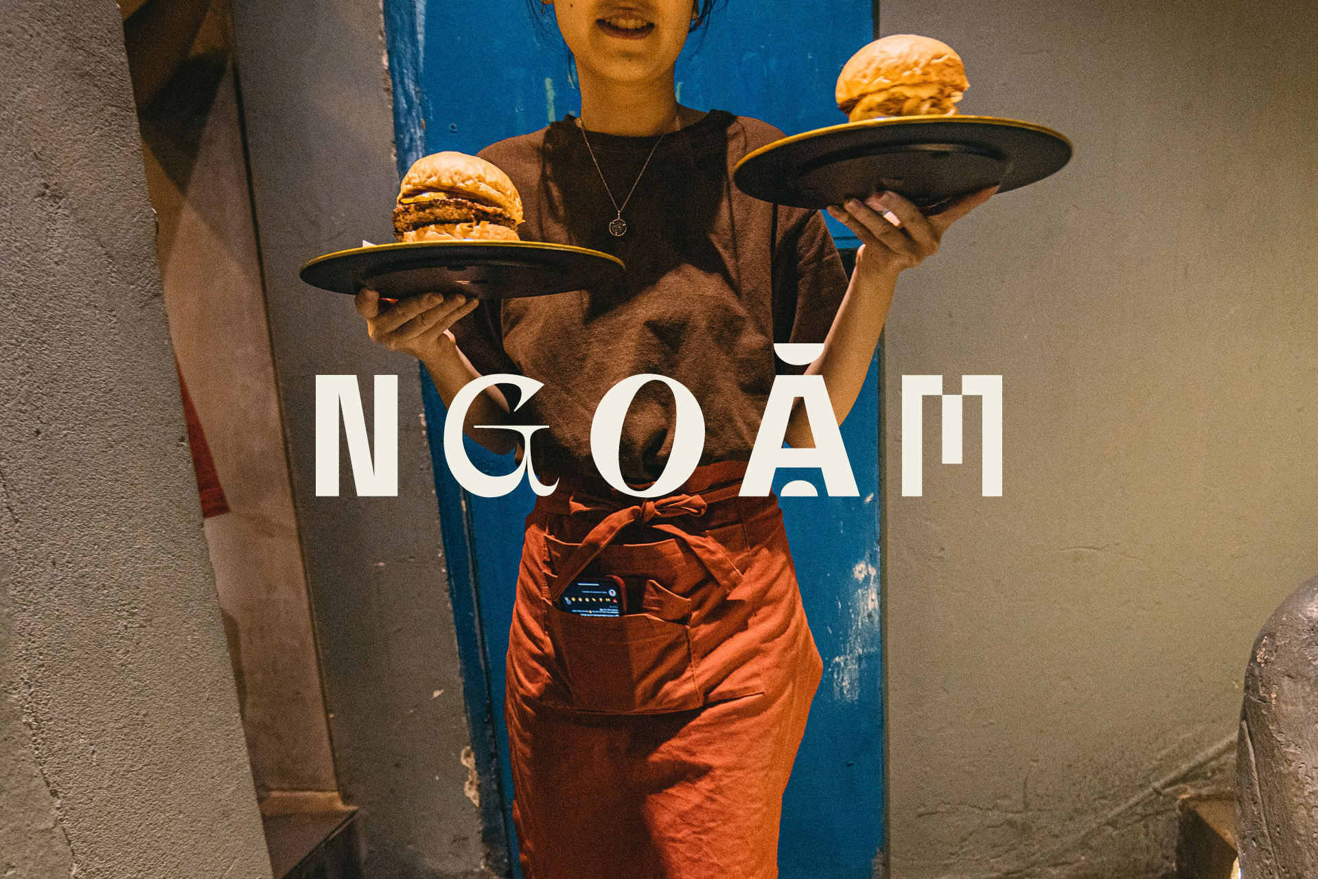
Ngoam:
Everything is a Remix
2020
Started off as an online business selling gourmet burgers, Ngoặm has garnered a loyal following of foodies. Since then the well-known western fast food has been Ngoặm’s house specialty, but elevated to a fine-dining level dish with traditional Vietnamese ingredients and cooking techniques.

Concept
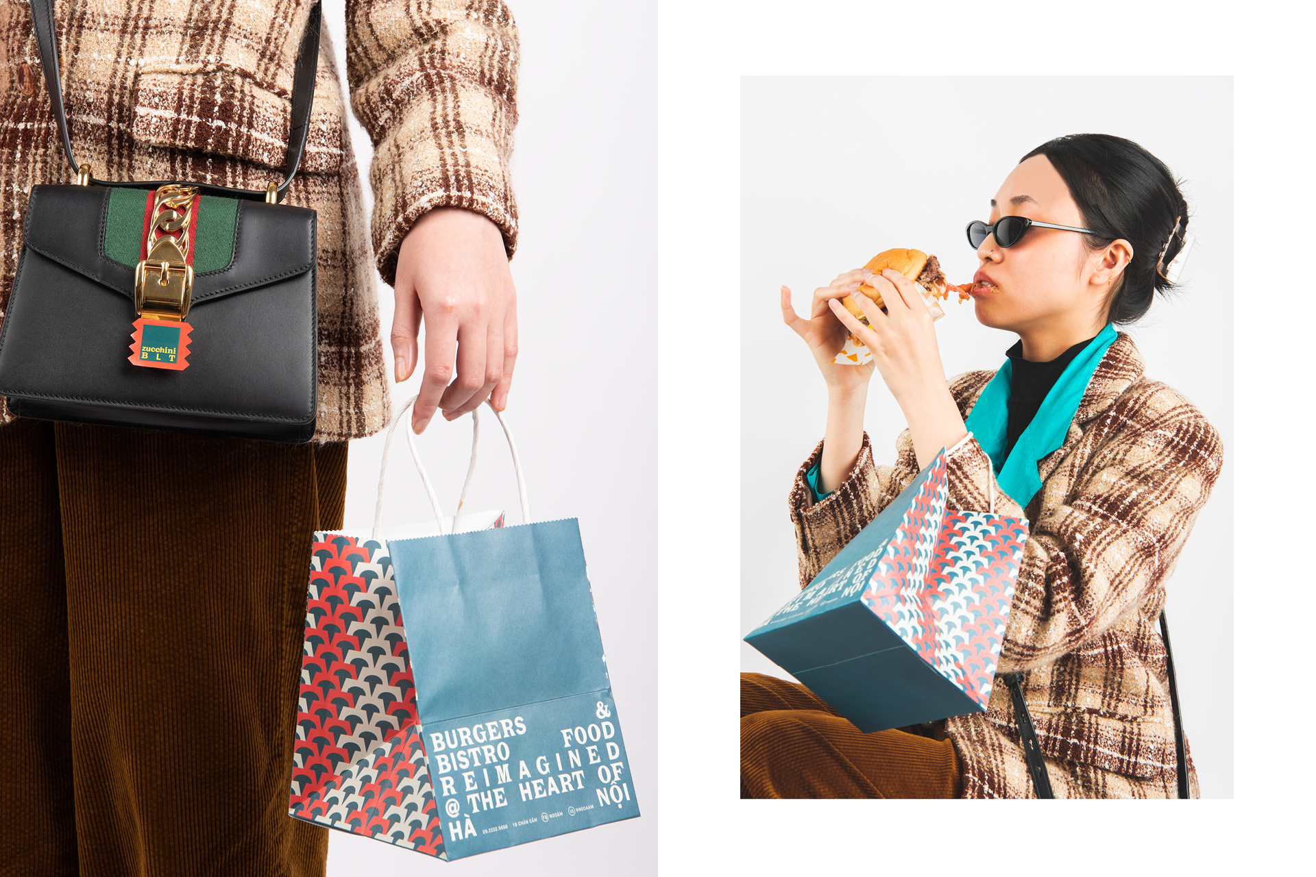
Ngoặm itself is a culture remix, where cuisine from all corners meet, greet and fuse. At Ngoặm, food is experimental—each dish is a concept and has a range of quirks to flaunt.We designed the visual identity for Ngoặm’s bistro and reconstruct the brand story to a cohesive narrative that highlights cultural diversity.
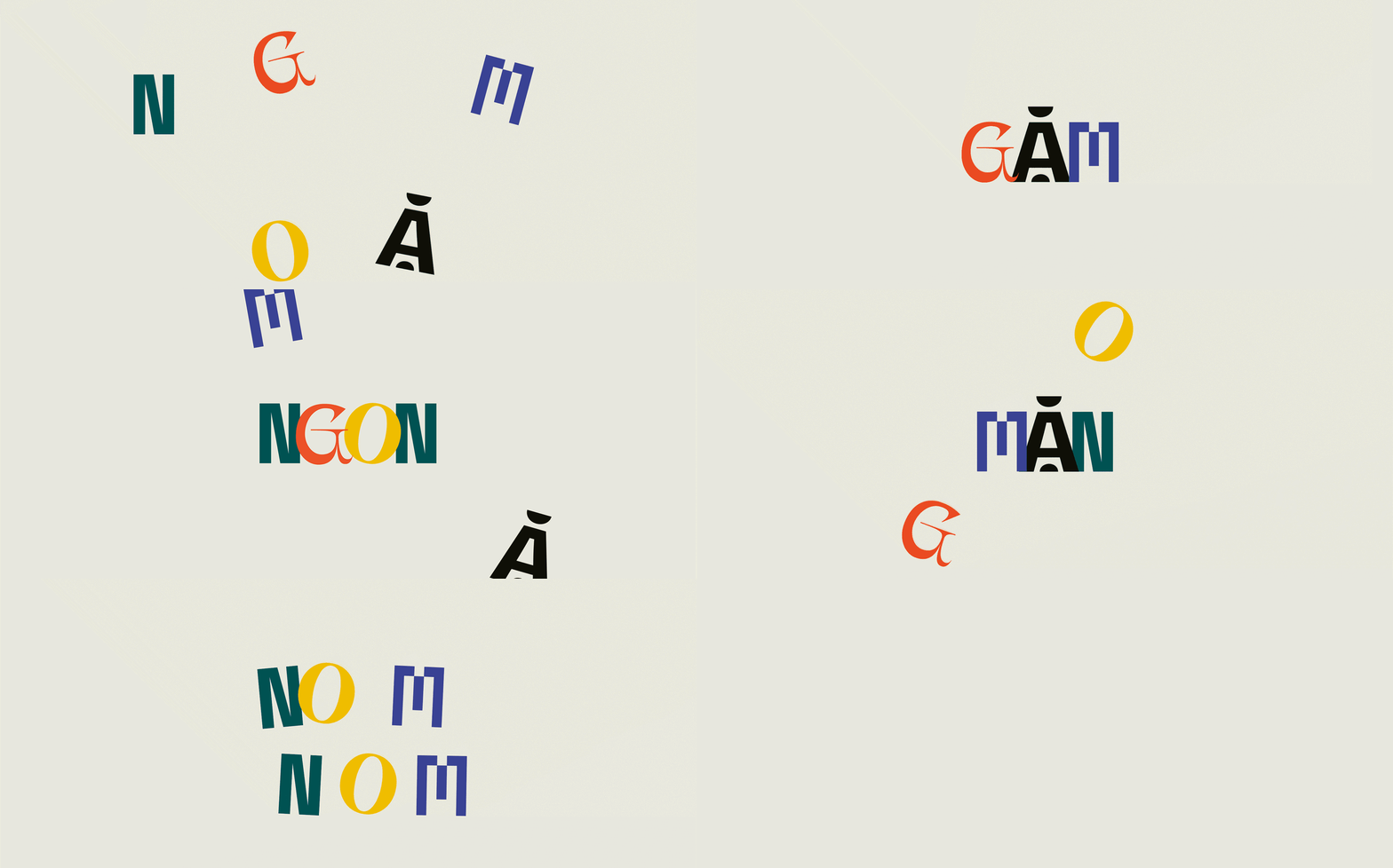
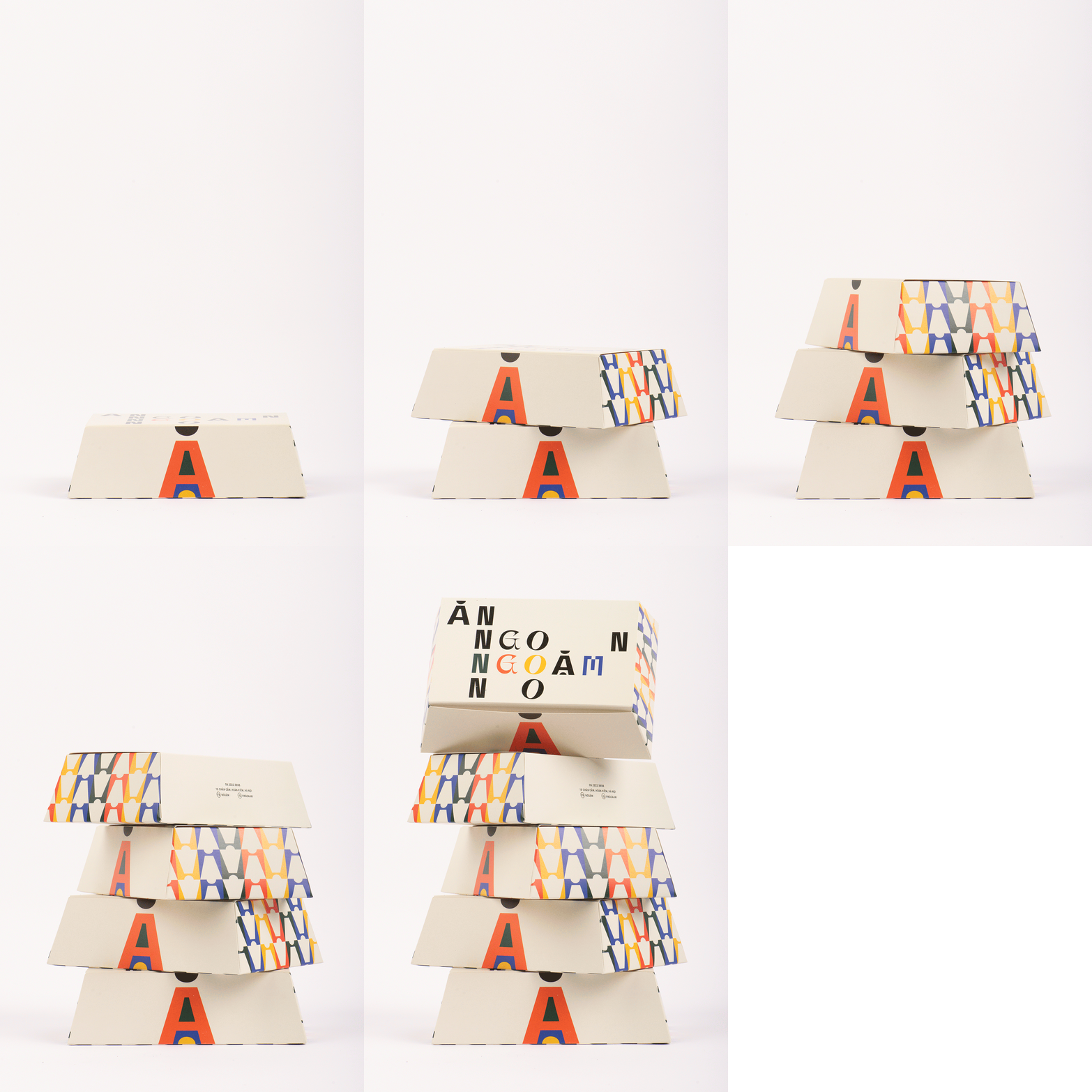
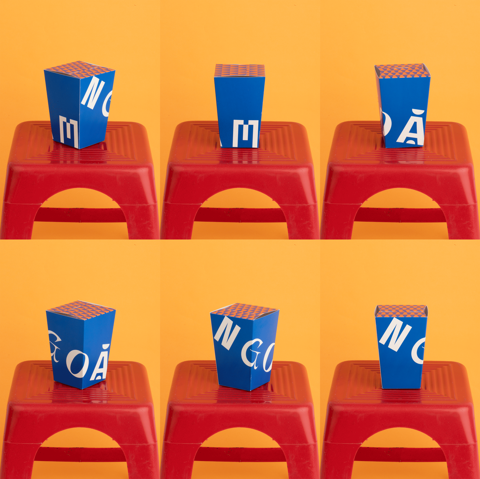
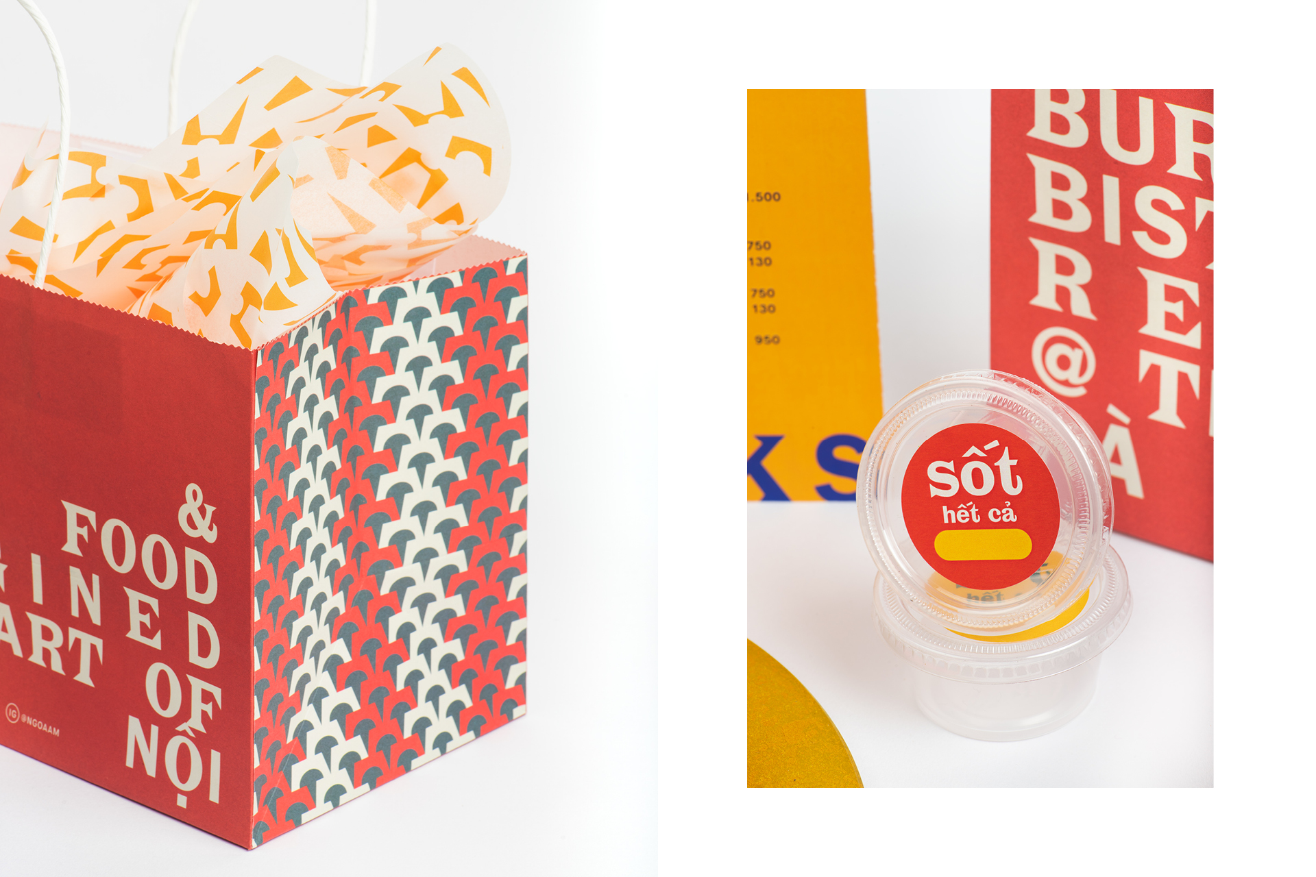
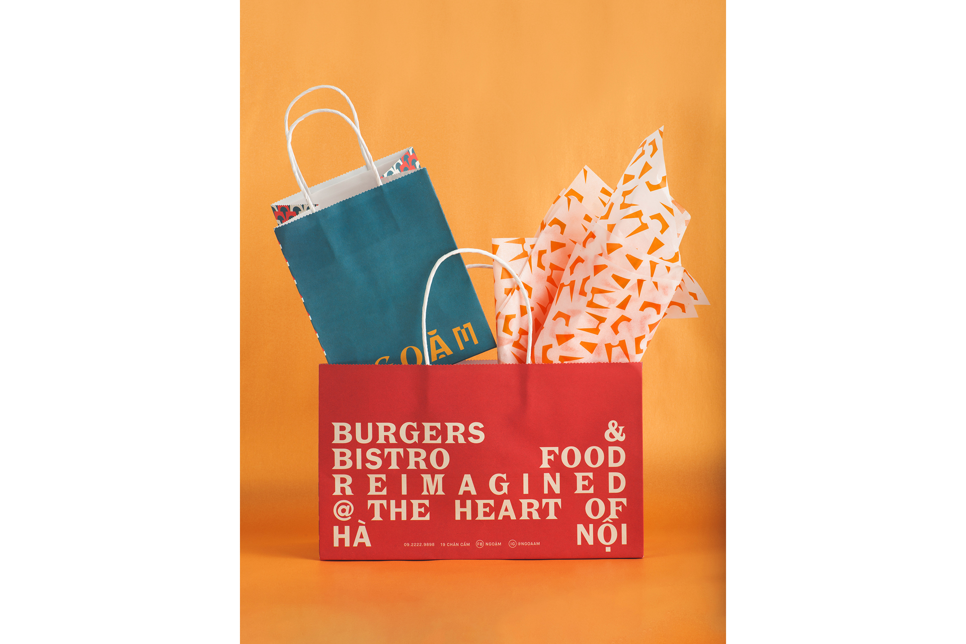
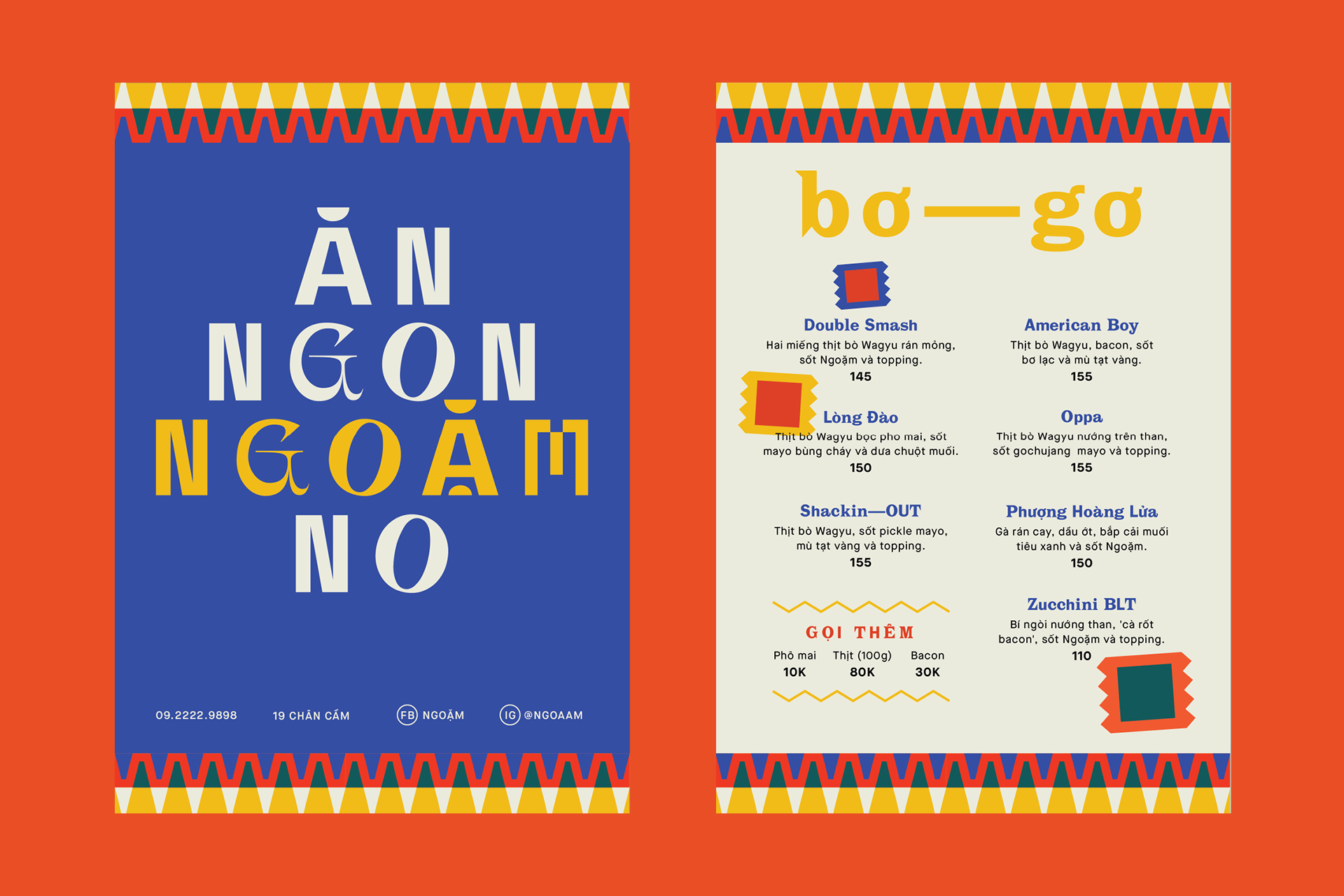
Using ransom letters as motif, we want Ngoặm’s new look to really make an impression of the place for experimental cuisine: where diversity becomes unity, where cultural ambience breathes life into each taste.
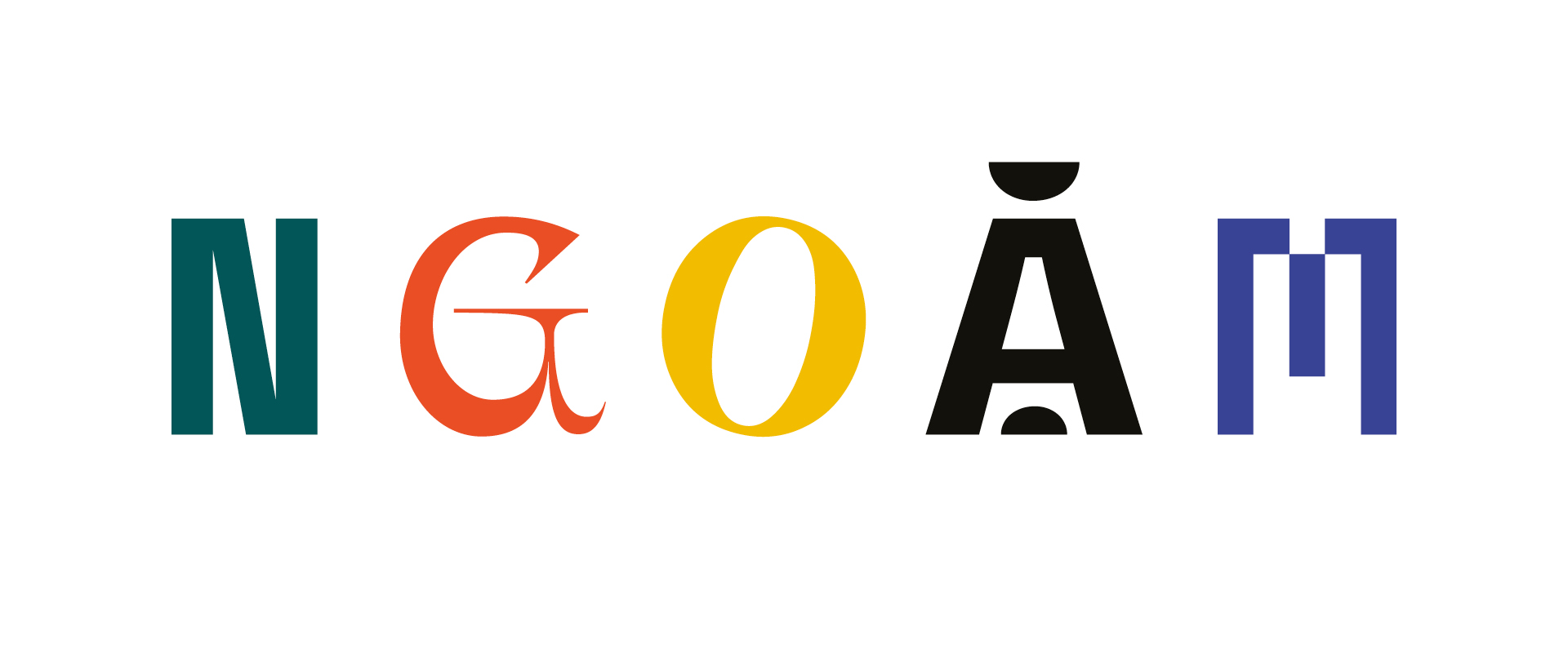
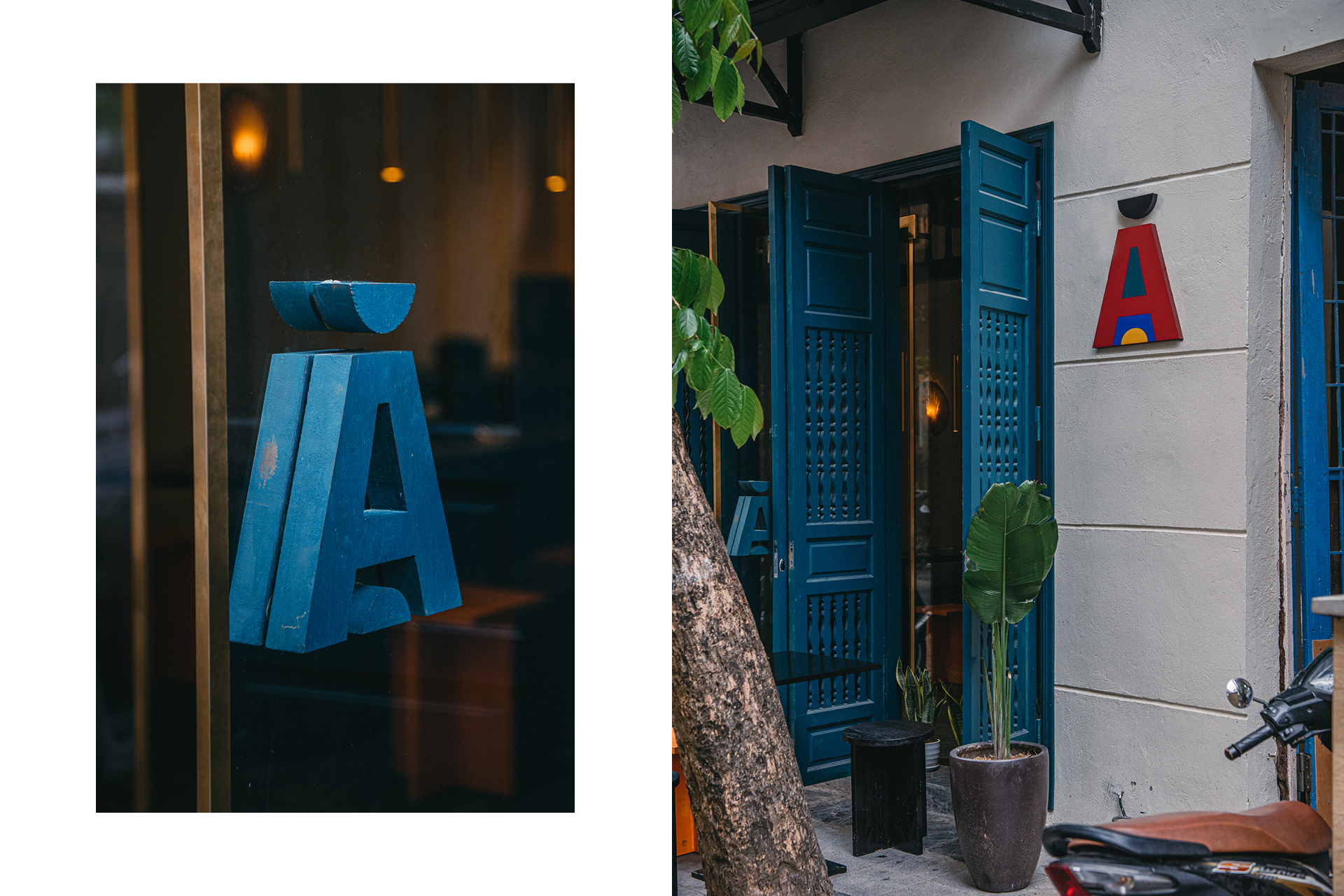
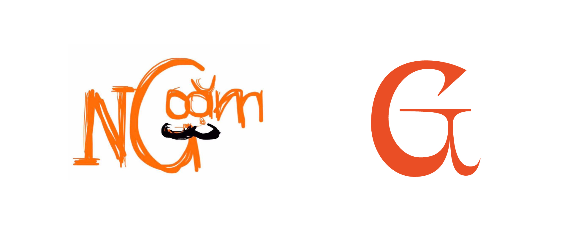
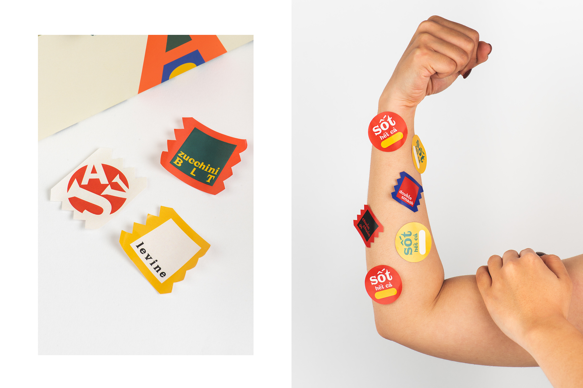
The logotype selects different complementary and eclectic typefaces, with a custom letter “A” as a literal visualization of “ngoam” (to bite/devour in Vietnamese), and a letter G whose form resembles the original Ngoam’s logo.

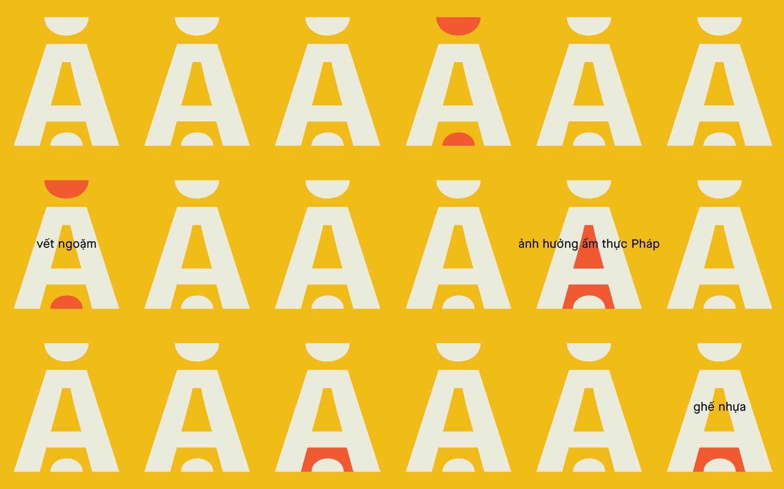
We took it further with the ransom treatment by turning “Ngoam” into an anagram. Each word in the brand’s slogan “An No Ngoam Ngon” is a reconstructed meaning from the anagram, along with mmmmany other words in the Vietnamese vernacular.
Color Palette
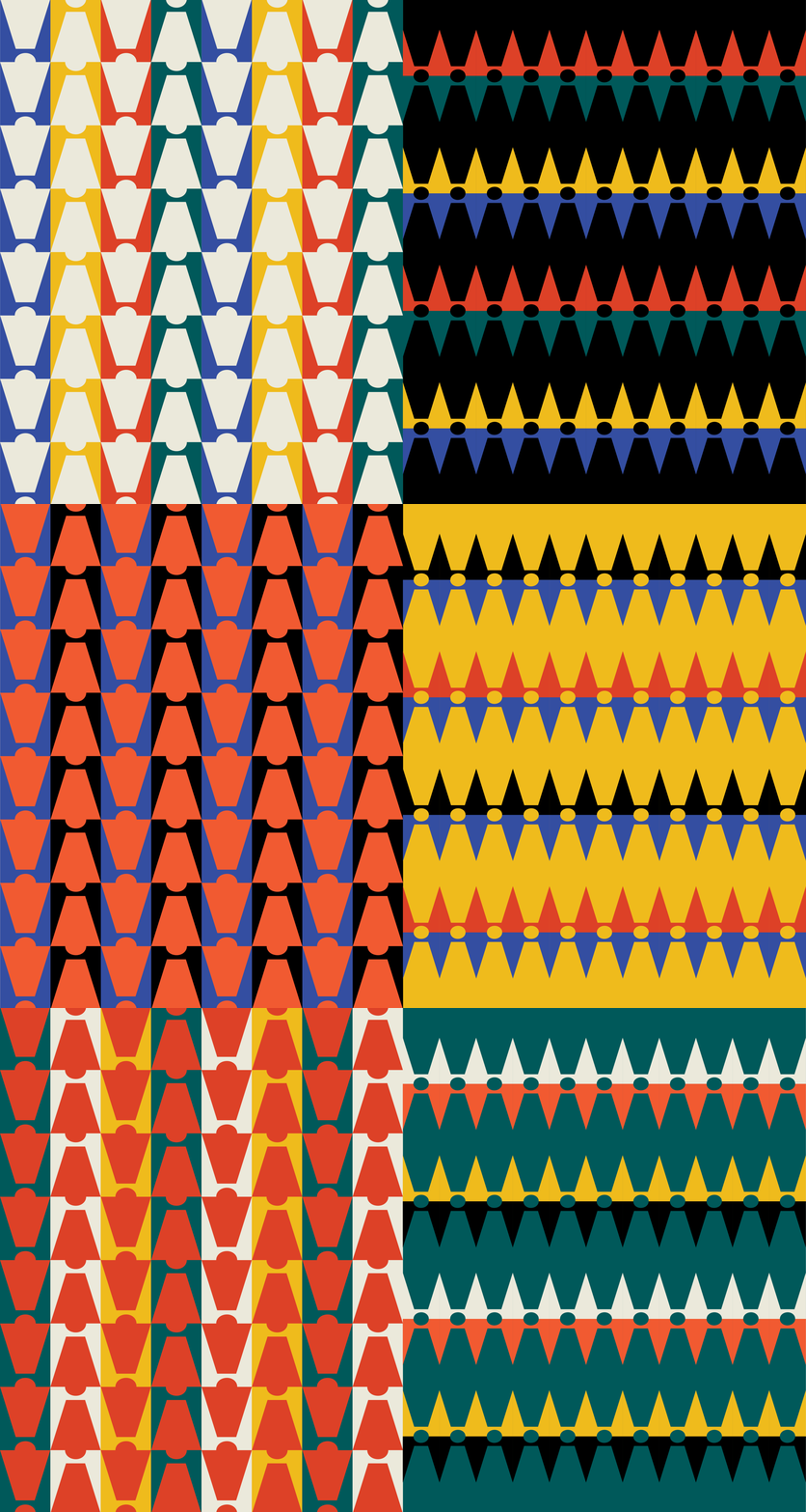
One of Ngoam’s key visual is the Co hoi (five-color flag), a cultural staple in Vietnamese traditional festivals. To Ngoam, every burger is a celebration. Naturally, we integrated the flag’s vibrant tones into the color palette.
One of Ngoam’s key visual is the Co hoi (five-color flag), a cultural staple in Vietnamese traditional festivals. To Ngoam, every burger is a celebration. Naturally, we integrated the flag’s vibrant tones into the color palette.


Graphic System
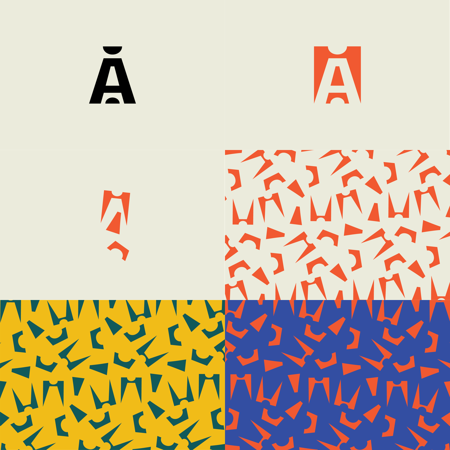
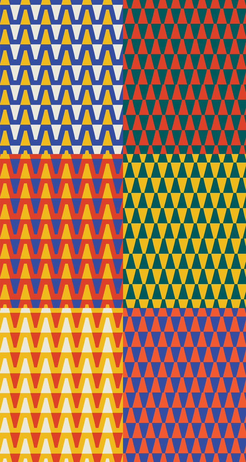
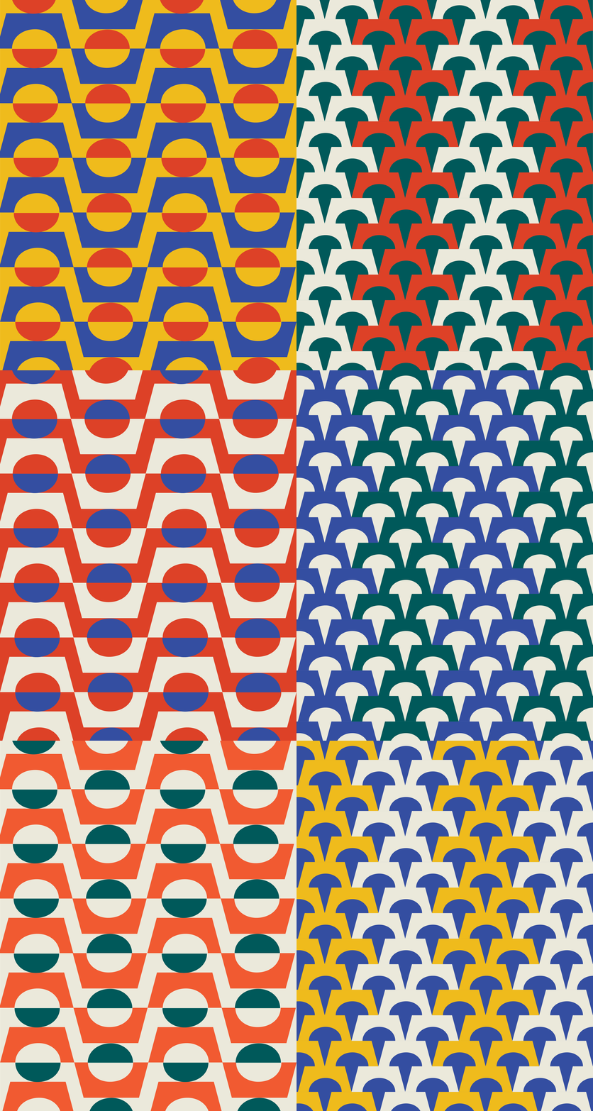
Inspired by the brand’s recycling food scraps into new ingredients, the pattern can be built from the negative space cut-outs of the icon. This gives flexibility to the graphic asset as there is no limit or any set rules to the amalgamation. Zero-waste FTW.
Inspired by the brand’s recycling food scraps into new ingredients, the pattern can be built from the negative space cut-outs of the icon. This gives flexibility to the graphic asset as there is no limit or any set rules to the amalgamation. Zero-waste FTW.












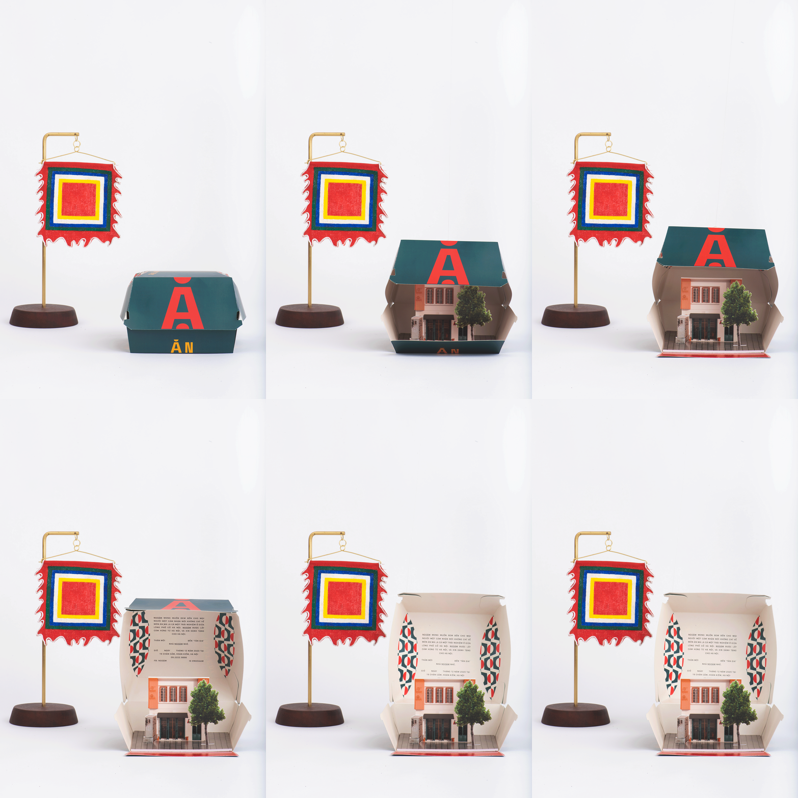
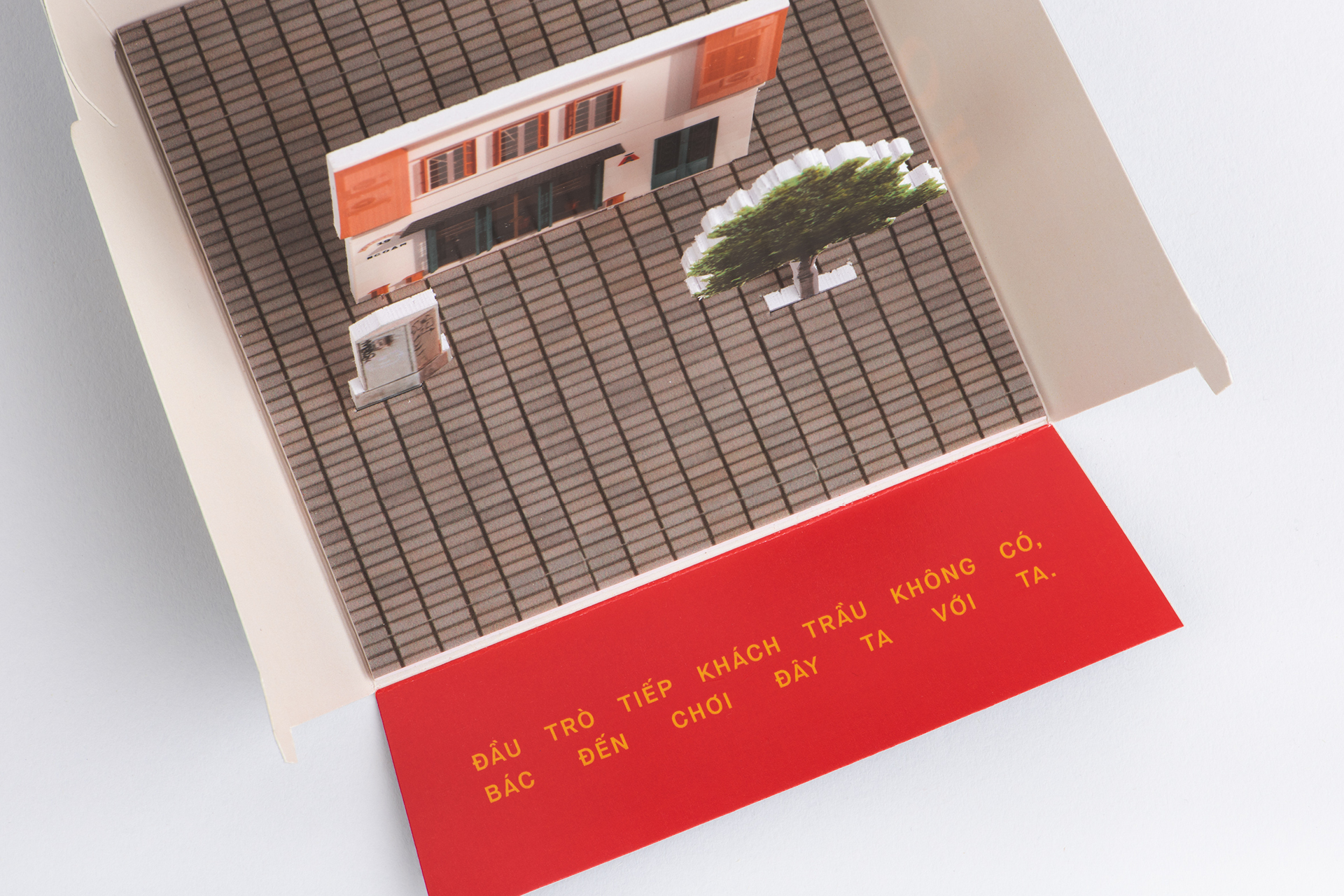
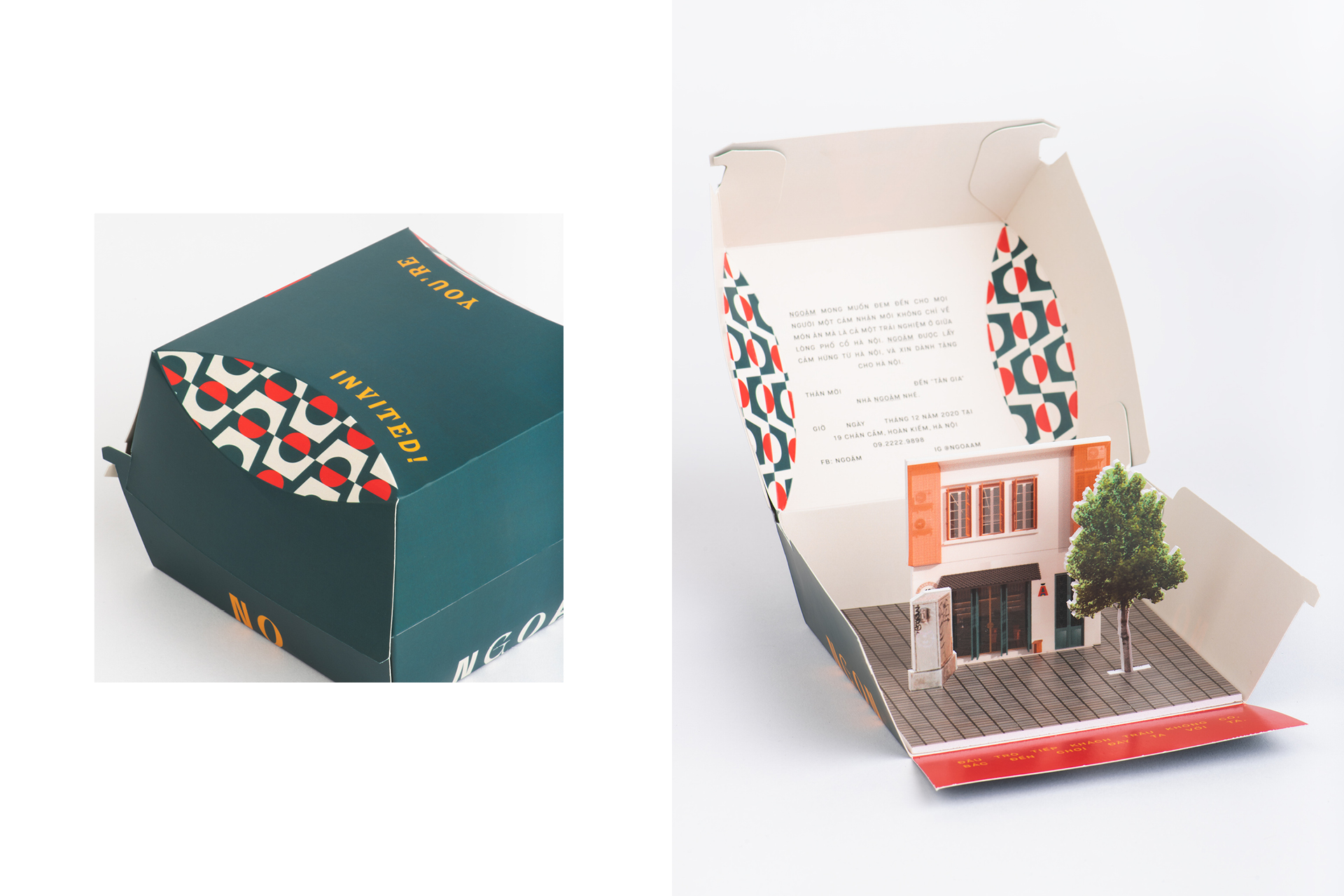
We created a pop-up invitation for Ngoặm's grand opening. The burger box was modified to reveal a miniature pop-up model of the bistro facade. It was designed to last longer than its original purpose and to become a shelf display piece for Ngoặm and customers.
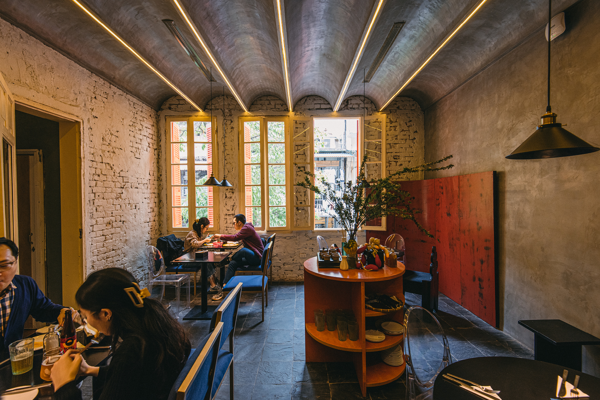
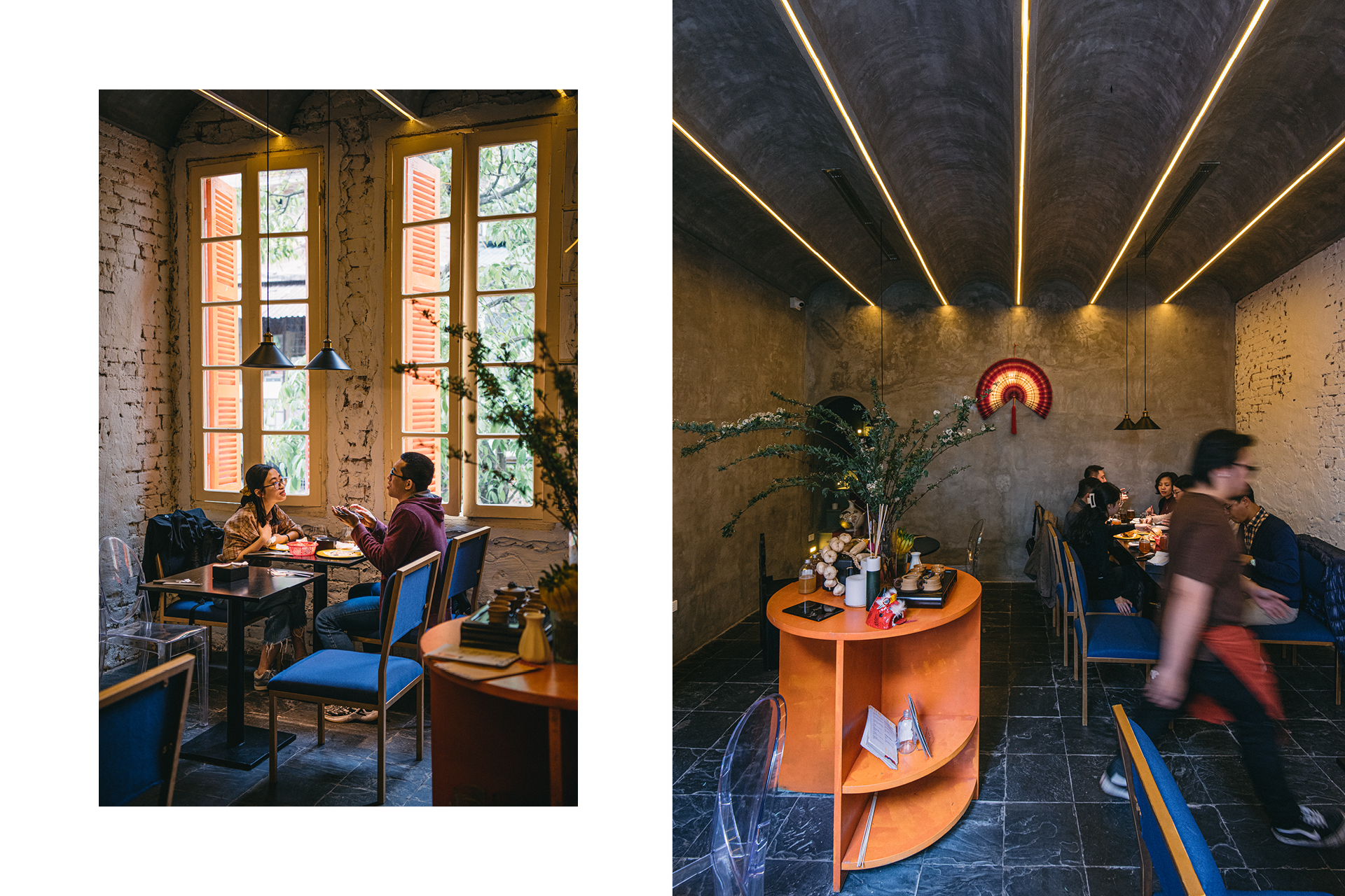
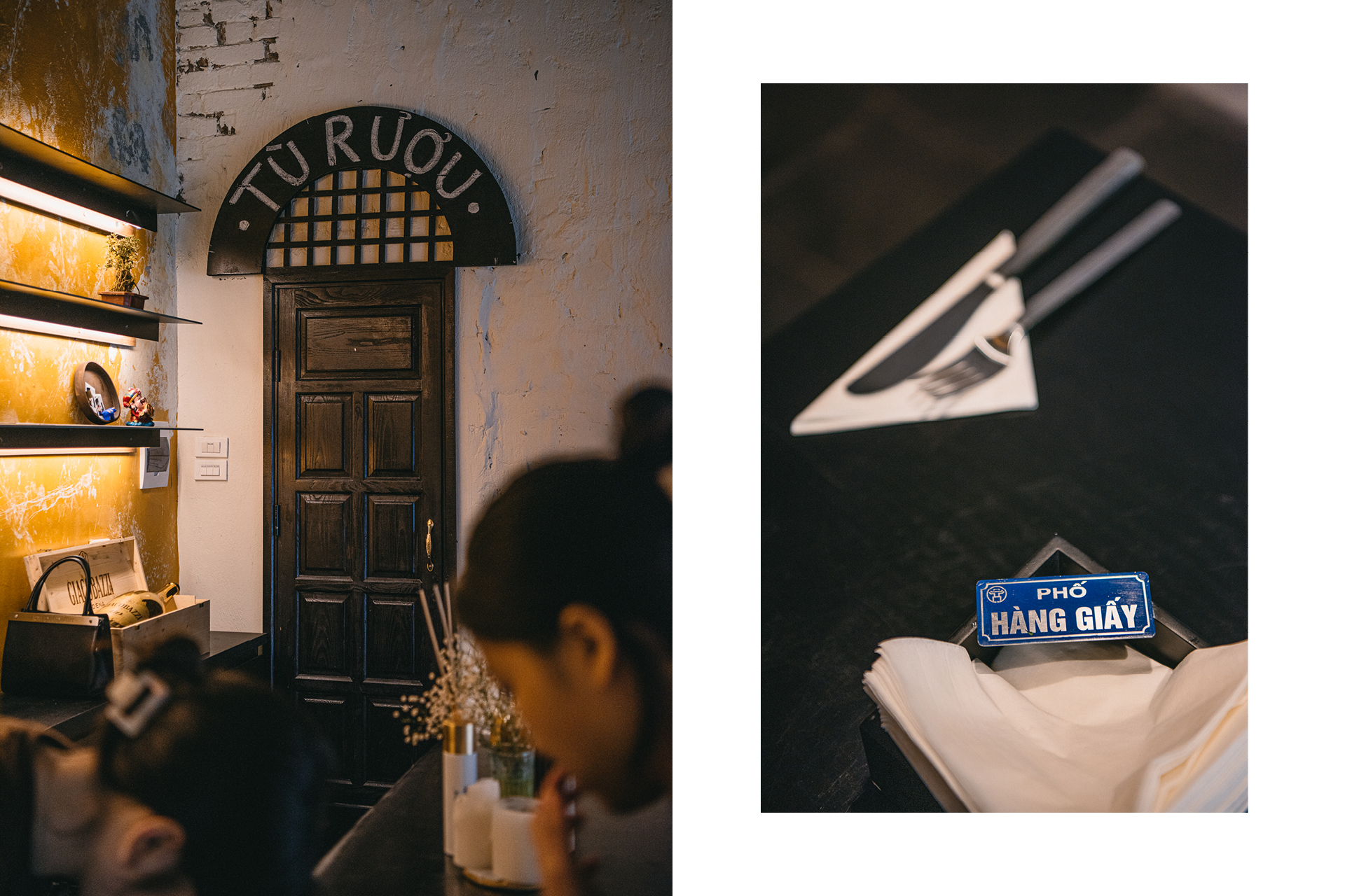
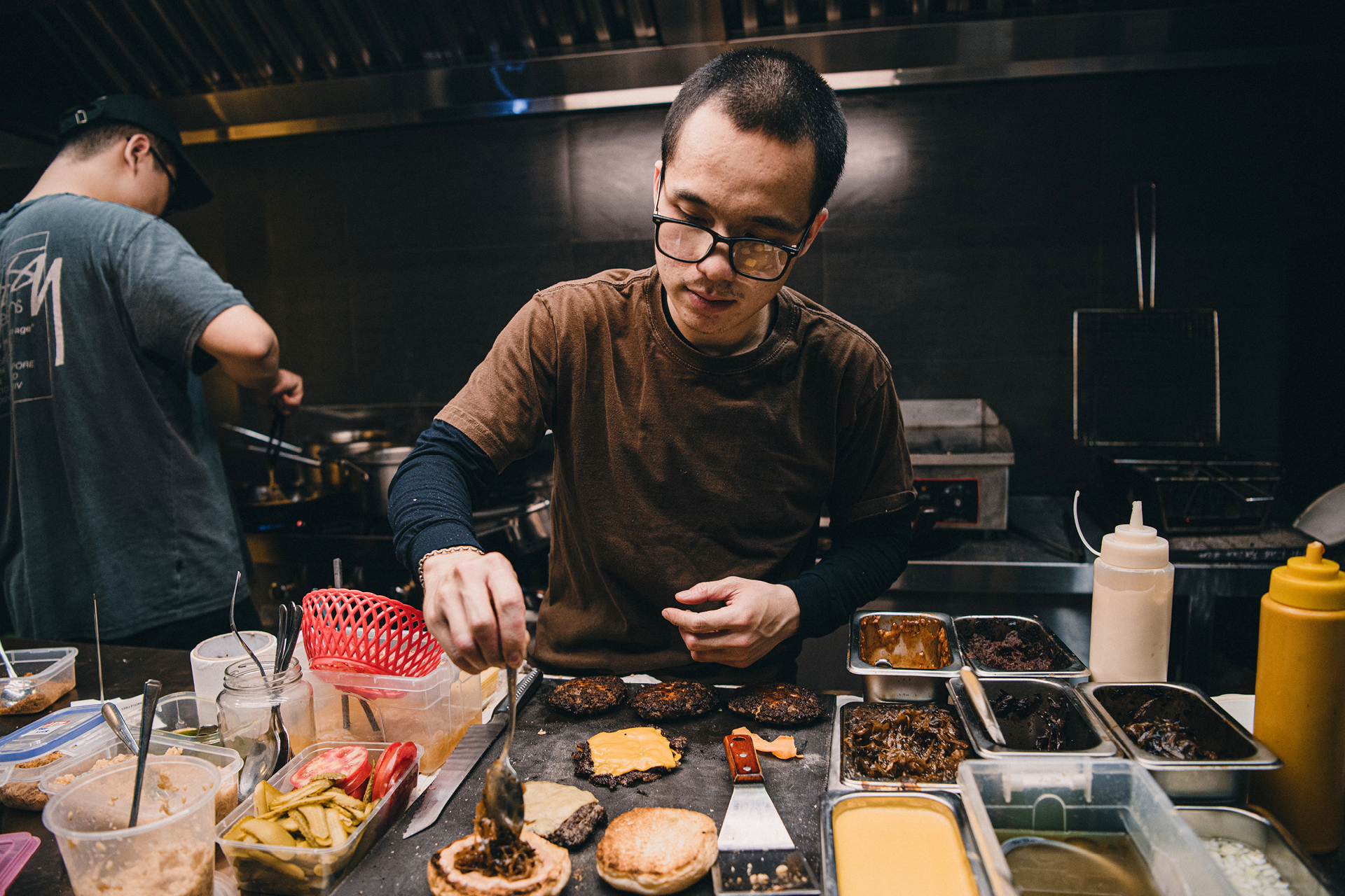

The brand’s mission is to not only celebrate diversity, but also honor community. Ngoặm wants to give back to the community by making gourmet meals at accessible price points, reusing scraps as ingredients to reduce waste, and teaching the art of food-making to those who need.


Design Team:
Colin Tran, Hiep Hoang, Dakota Nguyen
Project Manager: Chii Nguyen
Model: Ly Nguyen
Stylist: Dakota Nguyen
Showcase photography: Bao Khanh
Colin Tran, Hiep Hoang, Dakota Nguyen
Project Manager: Chii Nguyen
Model: Ly Nguyen
Stylist: Dakota Nguyen
Showcase photography: Bao Khanh